Ways to Take Your Searchie Hub to the Next Level
You’ve made the decision to harness the power of Searchie for your business. Aren’t you smart! But you don’t want to create a Hub that doesn’t reflect the excellence of your brand, right? Here are three tips to take your Searchie Hub to the next level.
Create with ‘Your User Want?’
One of the things I love most about Searchie is the ability to move material around based on what the user needs and wants most. When first thinking about your Hub, think about what your user wants to know. What’s top of mind for them? How do they think about your material or product? What questions do they ask you most? How can you customize the experience to optimize their time?
I often tell my clients that they think they need ABC but if they want to know XYZ, then it’s best to put XYZ front and center. And, in a way that really resonates and speaks to them—in language that resonates with them.
Many people think they have to do this with a quiz or an assessment. This isn’t always the case. You can do it by just putting the material they most want to know front and center.
Design a Hub that’s Yours & Yours Alone
When your user first enters your Hub, they should know it’s yours. It should speak to them. You want them to have a feeling about you and your business. Ideally, it will be distinctive to you and won’t look like anyone else’s Hub. Thanks to Searchie’s Canva integration, you can create thumbnails and backgrounds to design a unique experience.
Create a “hero” section at the top using a “Call to Action” that welcomes your user to the Hub. This doesn’t always have to include a video. It can just be the words, “welcome” or “hi there!” or whatever else you’d like to say. You can use a media here to link to a welcome video from you. If your course of membership really centers around you and your teaching, it’s ideal to have your face in this section. Your user will feel right at home seeing you when they come into your Hub! Some of you are shy about this, I know but it’s a great way to make your user feel connected to you.
My client, Patricia Dent did a great job of this in her Hub—check it out:
Searchie allows you to use Hex codes to choose colors for many aspects of your Hub, from backgrounds to buttons. So be sure to go with the brand colors you are using anywhere else your brand is found: website or blog, social media, product materials, etc. If you don’t have brand colors, Canva has some awesome color combinations...no sense in spending a ton of time when the experts have done the work for you!
Patricia also did a great job of keeping her branding and colors throughout her Hub:
I also recommend using the same photo filters in your Hub that you use in your social media and other posts. Using consistent settings is a subtle way to create branding consistency across all your platforms. If your font is available in Searchie, use it or something similar.
Roll Out the Red Carpet with a Site Tour
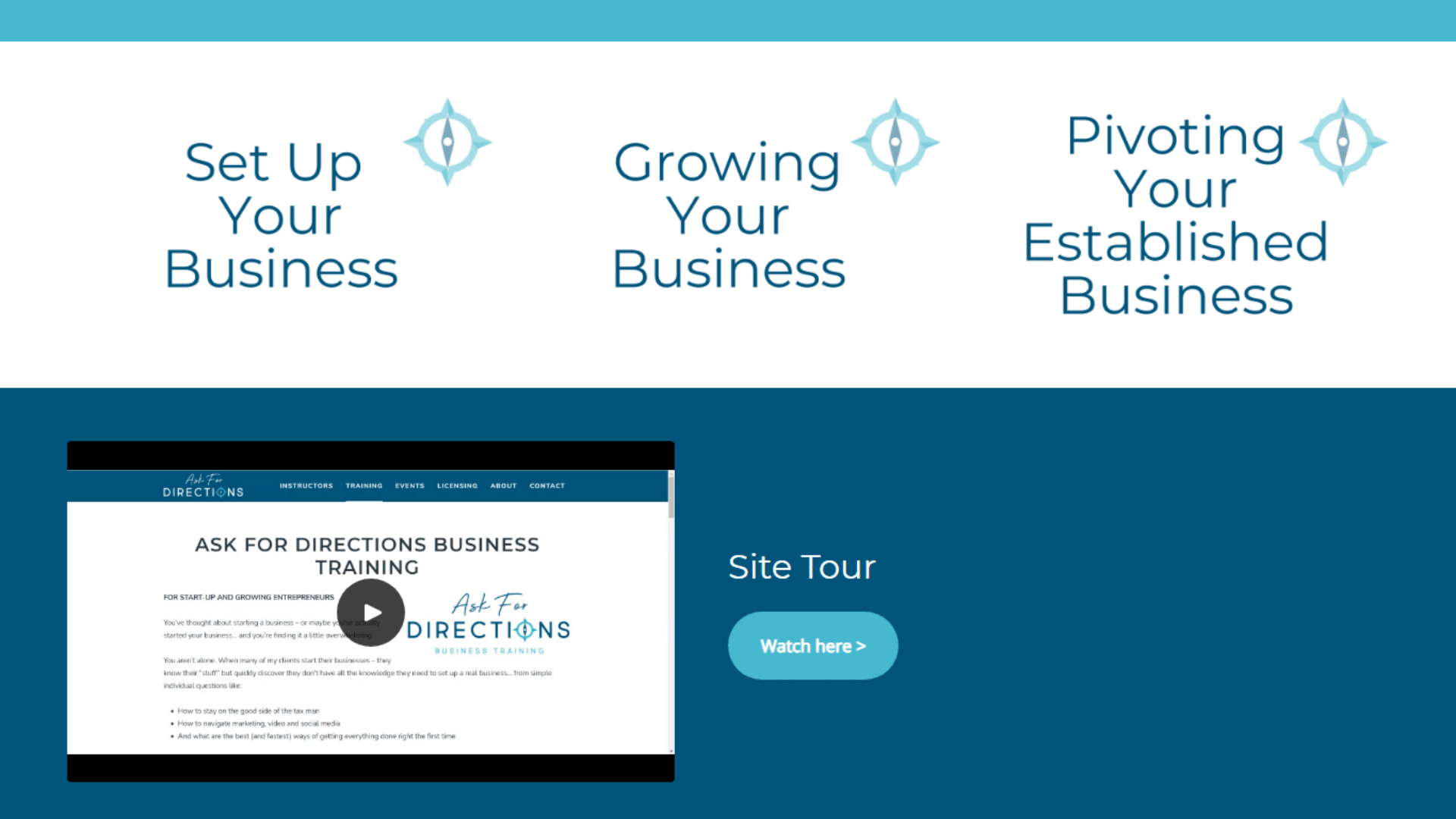
I suggest creating a video for your users that greets them upon their first visit and provides a tour of the Hub. You can head off many client questions at the pass by showing them how to use the Hub and giving them tips and tricks. Don’t assume they know things like how to find an attachment, bookmark the URL or how to access the account settings—show them! :)
Don’t Forget the Basics
You may think your people know when your next meeting is or how to get the Zoom link but it’s not always so easy, right? Believe it or not, your course or membership isn’t top of mind to them like it is to you! So, serve this kind of material straight up. Even if you’ve provided the Zoom link in the calendar, go ahead and make it another link so it’s super easy for them to access. And, even if you give the calendar to them, make sure it’s one they can download, too if they want. Some like to just view it, others like to download it.
Caryl Pomales of Caryl Fine Art has done a great job of this in her membership Hub, The Painterly Way. These items are the first thing her members see after the welcome:
Uplevel with Tagging
Using Searchie’s tagging system and playlists, create a “top 10” list of most asked-about or discussed topics. As discussed above, what do your users want to know most? If you’re in the health arena, it might be topics like, neck pain, back pain, stretching, snack recipes.
To set this up—Here are some detailed instructions:
Inside your Hub, create a CTA grid of those topics. Go to customize, create a new section, create a Call to Action Grid.
In Searchie, create playlists with those topics. Create a playlist by going to playlist on the left menu and hitting the plus button, then name the playlist with that topic.
In Searchie, create a tag with each topic by going to Media on the left menu, going to any piece of media, going to the box to the right of the three dots and checking that box, then go to Add/Remove Tag, then go to New tag and type in the new tag.
In Searchie, on each playlist, go to “automate” and assign that topic tag to each playlist. For example, the playlist neck pain will have the tag neck pain.
Then, back in the Hub, assign each CTA grid with the playlists. Go to the Call to Action Grid you created. Go to Card 1. Go to Choose a playlist. Find the playlist topic you created. For example, neck pain. Then save. Then go back into the Call to Action Grid. Go to Card 2. Select another playlist you created. Save. Hit the back button that is above the words Call to Action Grid at the top of this section this time. Now do Cards 3-10 the same way. If you want, you can change the background color or make an image background by changing the theme in each card—under the “Theme” dropdown, where it says “Default”, select the appropriate option.
In Searchie, after you’ve filmed or imported a video, anytime a video mentions that topic, tag it. Go to Media, go to that video/media, go to the box to the right of the three dots and check the box, go to Add/Remove Tag, and check the tag name. That piece of media will now be assigned to your playlist and show up in the Hub on that CTA grid under that topic. How cool is that? I think David Letterman would be highly impressed!
I’ve included a great example of a client, Katie Pitts of Sleepwise Consulting, who did this in her Hub. She knew her clients didn’t have a ton of time to search topics so she provided the topics for them front and center.
Install a Searchie Search Bar
When creating your Hub, be sure to add a search section—especially if your Hub has lots of content. The search bar can be placed at the top or bottom of your Hub (or in the middle, but I think that makes it harder to find). It’s important to include this and to show your users how they can search for specific content. Your clients will thank you!
Get Creative with Attachments & Links
Did you know that there are two ways you can show your users attachments and links now? Yep, that’s right, decide how you want your viewer to see material—there’s Gallery and List view. Which do you like better?
To set the view, you need to go to the “Media” page in your Hub. Select the page layout, then save.
There are also many ways to show attachments, I review them in this blog article. Again, one thing to keep in mind is that people think differently. Some miss the attachments when they’re in videos. If you provide a separate section with links and attachments, it may help those users who might otherwise miss them if they were only linked to a video.
Caryl has also provided her members a “Handouts” section to make it easy for them to find attachments and links. They have them with each lesson but also in this easy-to-find section on the homepage of her membership.
Archive Like a User
When you “archive” material, think about how a user might typically find it. Will they really know to look for it by month? Would you know to look for Facebook marketing tips in September of 2020? Not likely. But, you would likely look for them in a Social Media archive. The same actually goes for things like guest speakers. I might not remember the name of the amazing Susie Specialist who spoke on Amazing Ways to Improve Your Searchie Hub. But, I will remember that she spoke about Searchie. Best to archive the material by month, guest speaker and broad topic if you can. That way, no matter how your user thinks, they’ll be able to access the material.
There are More Ways to Uplevel Your Searchie Hub!
These tips just scratch the surface. What have you done to make your Searchie Hub “next level”? Send me screenshots or videos!
Follow my Searchie Success Facebook page to increase your knowledge of Searchie and get great ideas for how to use Searchie for your business!
And if you need any help getting your Searchie Hub planned and executed, let’s talk. I save my clients tons of time and help them get the Searchie Hub of their dreams!
Top Past Blog Posts
Get Your Searchie Hub Up!
This is really all you need to get started! Personalize your Searchie Hub with a few easy clicks. These clean, fresh, professionally designed Canva templates work right in Searchie. All you need to do is add your own images.


