
7 Tips to Make User-Friendly Searchie Thumbnails
When you’re creating a Searchie Hub, you need to use thumbnails—small images that serve as a cover image for playlists, videos, modules, and more. No problem, right? You’ll just whip something up in Canva and be done with it. Not so fast, partner.
Your thumbnails need to be thought through before you go using them. Whether you’re creating them yourself or using templates you bought from me, consider these best practices first.
Keep a Consistent Theme Throughout
Create one thumbnail theme and apply it to all of your videos. Too much variety gets overwhelming for the viewer before you know it.
If there’s one thing I know about Searchie Hubs, it’s that the content grows and grows.
If all of the thumbnails are hard to read or are too confusing, the viewer will not really see them. They won’t serve any helpful purpose regarding Hub navigation.
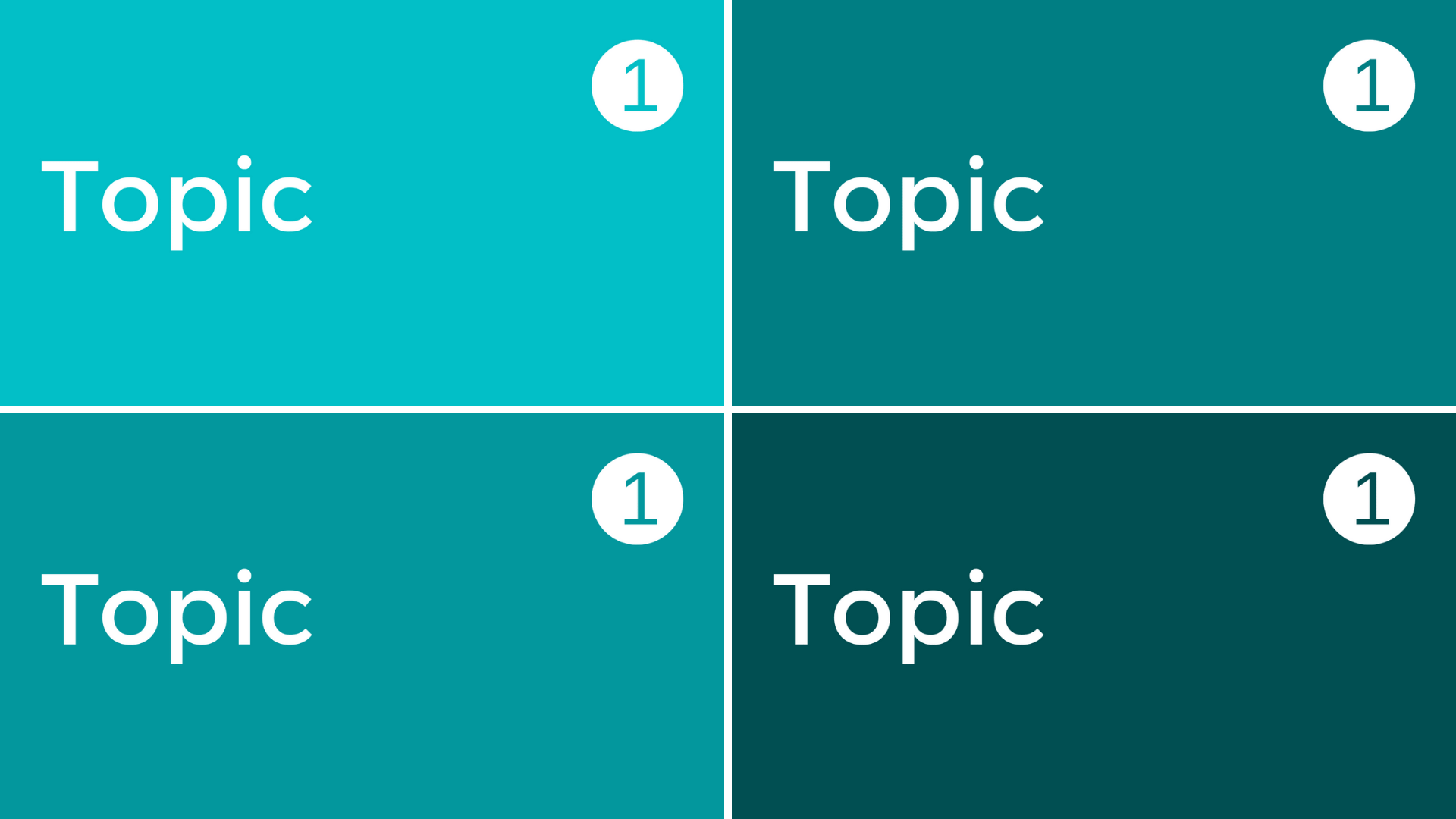
Develop a System
The best Hubs I’ve seen have a system in place for the thumbnails.
Got a bunch of topics? Try a different-colored thumbnail for each topic.

Or, keep the color the same but use a slightly different variation of the color theme.
You can combine colors and images to further stratify your content. Perhaps you have workout videos on your Hub. Here’s an example of how you can differentiate the types of workouts:

Continuing with this theme, you can think of additional themes to create variations such as:
● letter coding for the experience level (B for beginners, A for advanced, etc.)
● numbers for the amount of time for each workout (10 for 10 minutes, 30 for 30 minutes, etc.)
● images for the parts of the body worked (abs, shoulders, etc.)
● color to differentiate the types of workout - types of yoga, for example (yin yoga, wall yoga, hatha yoga could all be various shades of green)

How easy you just made it for your users to find the workout that is perfect for them!
Mix it Up with Images
Some people use different images for the different types of thumbnails. You’d use one specific thumbnail for your archive of live coaching calls, another for dripped content videos, another for a playlist of resource videos… you get the idea. Or, one image for stage 1, a different for stage 2, stage 3 and so on.

Color is Key
Whatever you do, keep in mind the color wheel. You want to use colors that are opposite each other on the wheel.
Or, colors that are tertiary, or, on the ¼ hour as I like to think about it. . .if you find a color at midnight, then you’d want a color at 3:00. Or, if you find a color at 1:00, then, the color you’d want to work with it would be at 4:00.
Here’s a quick article to consult on color.
Keep Fonts Simple
Use fonts that are easy to read. Bold, sans serif fonts in large font size is best (without extending features - or, as I casually say, anything squirrely around the letter). Keep the amount of text inside the thumbnail limited. You can use the title of the video to add further detail if needed.
To Logo or Not?
I say not. You can brand your Hub in other places. It’s really hard to create a thumbnail that doesn’t distract the eye. Do everything you can to create a clean experience for your user. Keep in mind the end goal, to help them consume your content.
It All Starts with Good Planning
I can’t count how many Searchie users have told me that they advise new users to create a detailed plan before creating their Hub. This plan will dictate your playlists, pages, tags—and thumbnails.
Do you have any ideas or tips for Searchie thumbnails? If so, I’d love you to comment with them below!
If you want help coming up with your Hub plan—or the Hub itself—contact me. I can create an amazing Hub for you super fast!
Top Past Blog Posts


Feeling overwhelmed by your content? See real Membership.io examples that turn messy files into calm, easy-breezy hubs. No tech headaches. Just clarity.